Introduction
Nation is an authoritative news and research website designed to make decision-making on complex topics easier for everyone.
Topic experts at Nation cover a broad range of content categories including recent trends and discoveries in health and wellness, travel, auto, finance, tech, and lifestyle.
Problem
Nation was a top-performing website in the System1 portfolio, however performance and growth had stagnated in recent months. In addition, the website design didn’t reflect a premier brand with a broad age range and diverse audience base.
I was approached by primary stakeholders on the product, design, advertising, and development teams to lead conceptualizing a plan and process to redesign the website to re-energize performance, optimize usability, and localize content types.
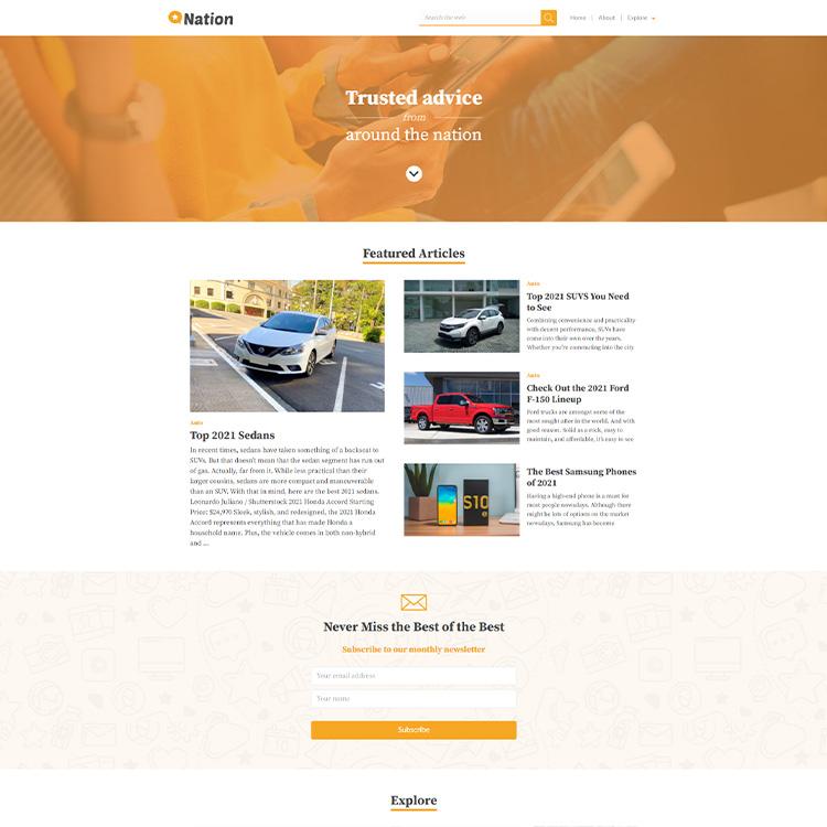
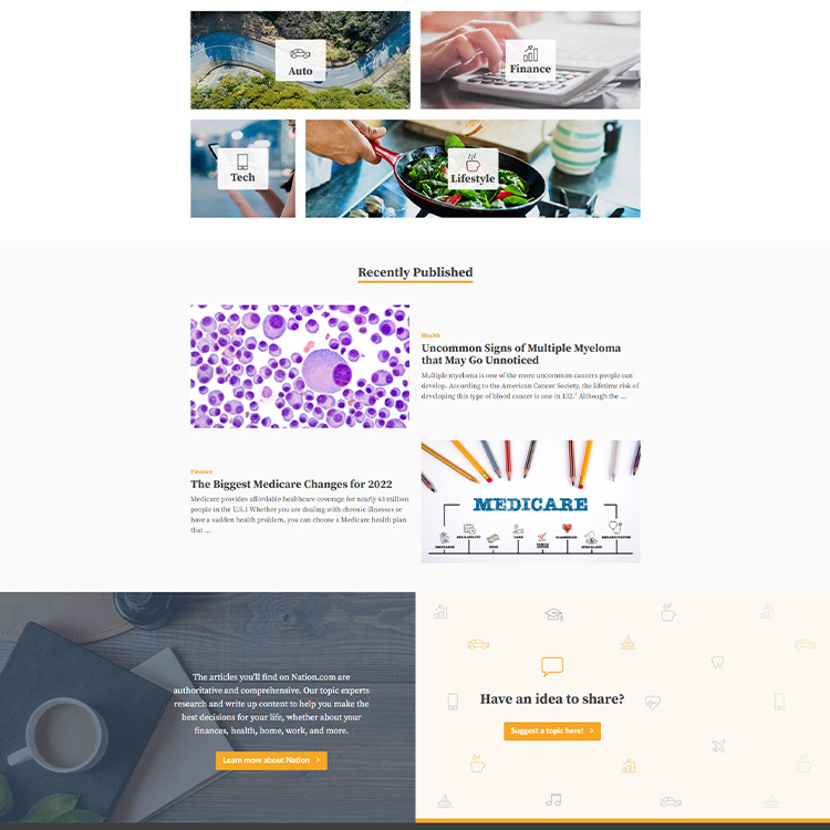
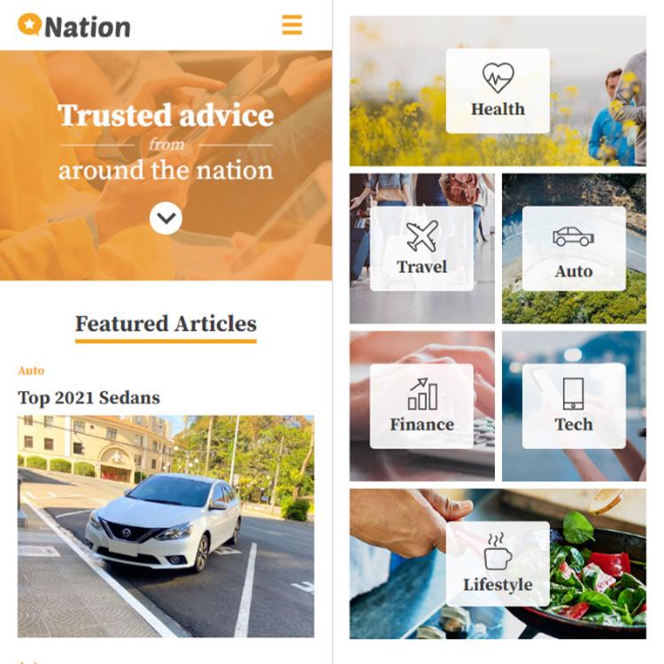
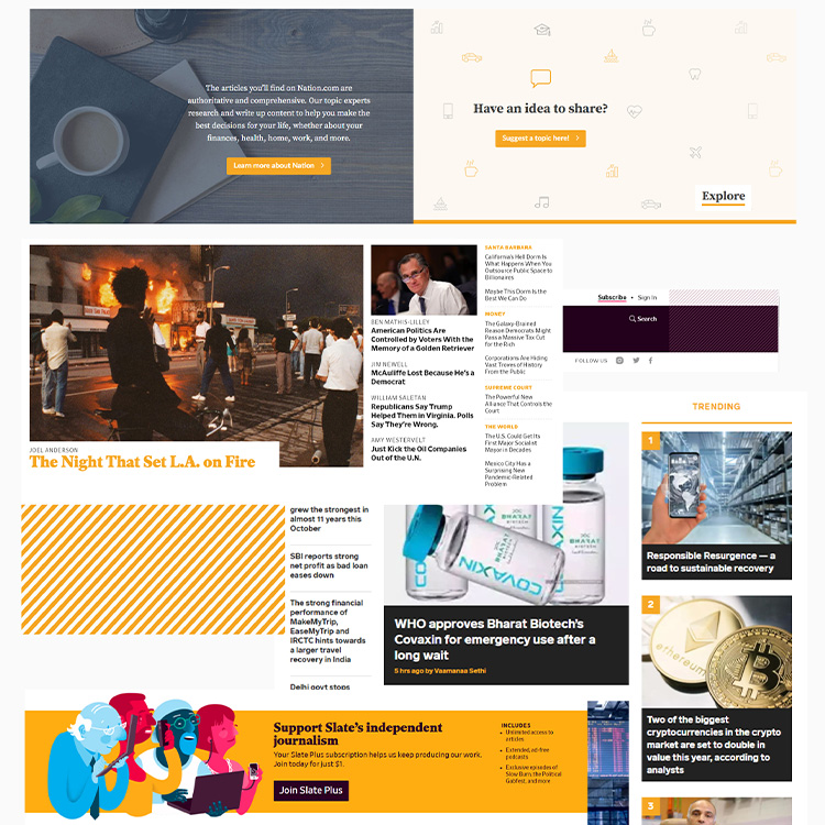
Archived Old Nation.com Homepage Design (Desktop/Mobile)
Conceptual Solution
Redesign the website to
- Update and modernize the brand to increase topic authority while also improving the layout to appeal to a broader, diverse audience
- Expand the property’s domain authority and branding to include regional-specific designs and translated content
- Update the website to increase the speed site and accessibility
- Optimize the user experience to increase engagement and loyalty
- Research
- Define Goals
- Design
- Implementation
- Results
1. Research
| Stakeholder, Subject Matter Expert, and Project Manager Interviews
After receiving the project brief, I met with the key stakeholders to understand their expectations and the goal of the project. Once stakeholder expectations were clearly established, the product manager and project manager were invaluable in understanding the history of the product and identifying known pain points.
We wanted to serve our non-English speakers users as well as our English as a first language speakers.
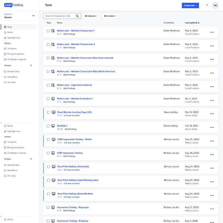
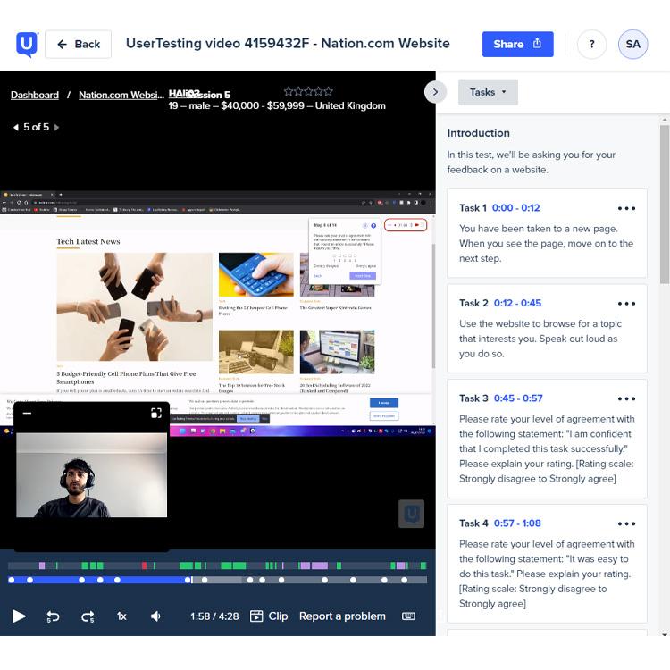
| User Testing
We conducted user testing sessions to understand the reasons for the problem.
- The website wasn’t encouraging users to return
- The major content topics weren’t obvious
- The website wasn’t serving non-English speakers, despite high user traffic
- The website had expensive related content not being properly utilized
- The website took too long to load
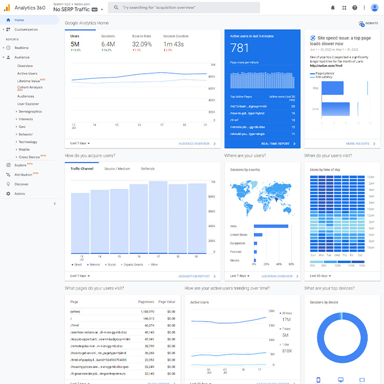
Google Analytics, Usertesting.com Interface, Usertesting.com Video Review Session
2. Define Goals
Using insights from internal research and the user testing sessions data, we identified and defined the key problems and set project goals.
| Key Problem
| The website branding and layout isn’t what is expected from a modern digital property |
| The website was slow and difficult to navigate, causing high bounce rate and low loyalty |
| The website had high user traffic from non-English speaking countries but no localization |
| Goal
| Update the website design to reflect the modern Nation brand |
| Optimize the user flow and improve page load time |
| Localize content – Japan, United Kingdom, France, Germany, South Korea, & Mexico |
3. Design Process
| Primary Applications
Figma, Photoshop, Illustrator, Usertesting.com
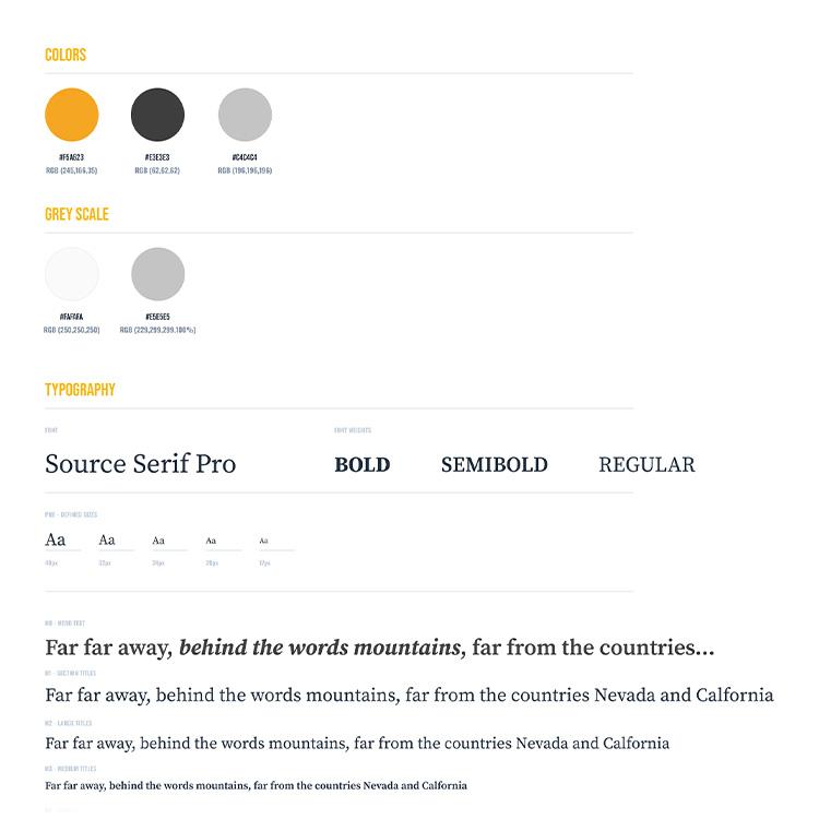
| Branding
The Nation brand is modern, helpful, friendly and welcoming – an accessible authority. The colours and typography reflected the brand, but they weren’t being used in a modern design and layout in the website.
Nation.com Branding & Typography, Primary Figma Design Board
| Moodboard
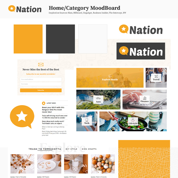
A mood board was created to communicate design direction as part of the presentation package for design sign-off and to gather inspiration for the project.
Nation.com Moodboard, Nation.com Article Page Wireframe
| Wireframes
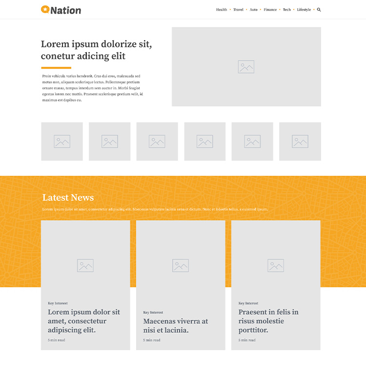
Wireframes were created to illustrate the new user flow and (home page / article page) layout.
Nation.com Homepage & Article Page Wireframe
| High-Res Mocks
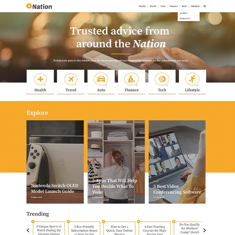
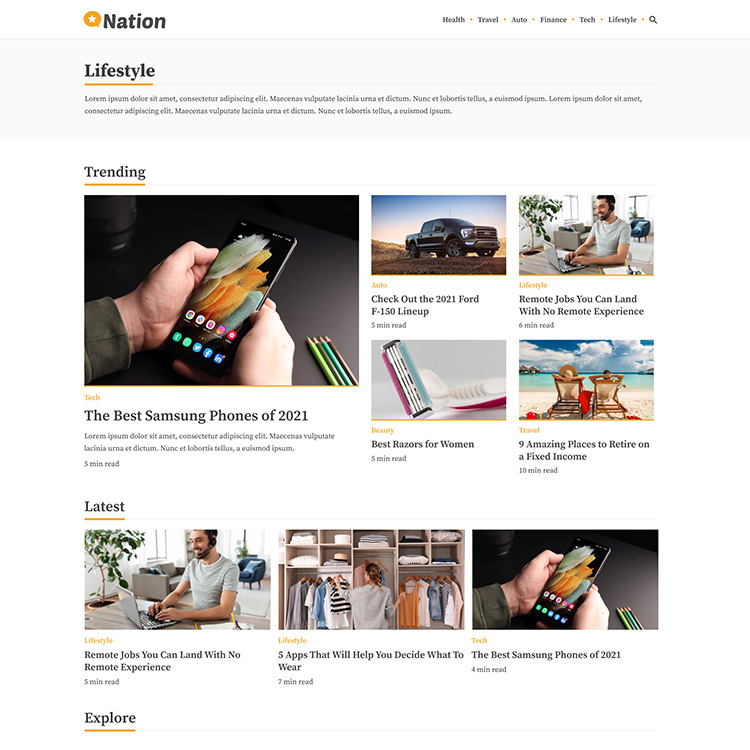
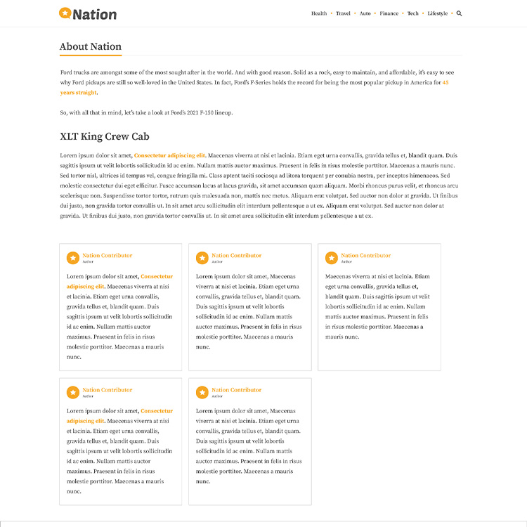
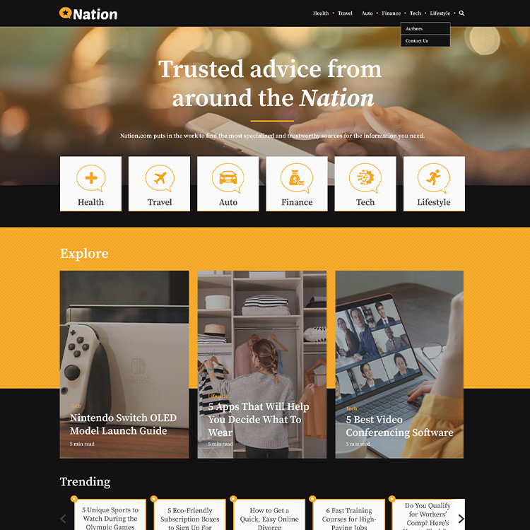
Hub Page – The goal of the homepage was to clearly communicate the Nation brand and direct users to take action ie. read an article, go to a content category.
Short-cut category buttons on the homepage were identified as a favourite feature from another System1 property and replicated for Nation to improve ease of use.
High Fidelity Mockups of Nation.com Homepage and Key Interest Landing pages.
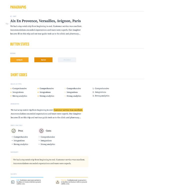
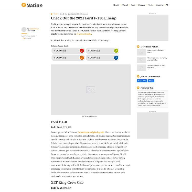
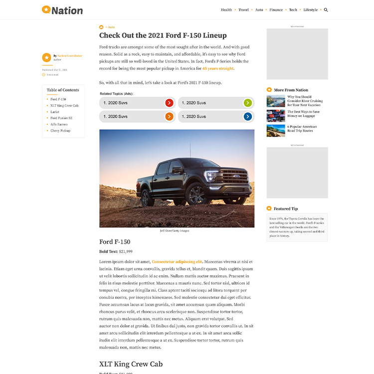
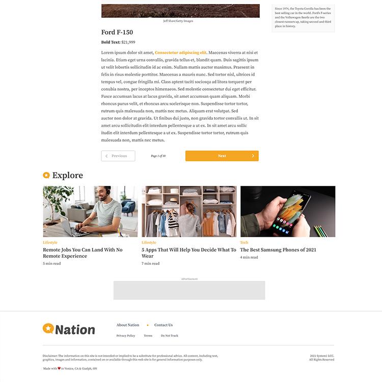
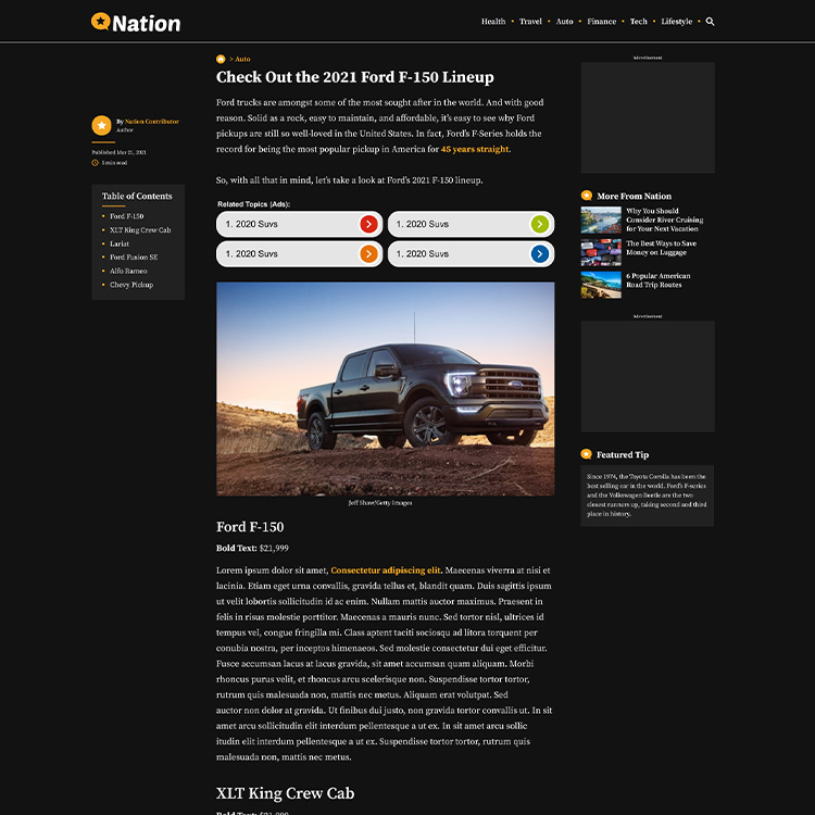
Article Page – Imagery restricted to two placements and advertisements restricted to three placements to manage page load speed.
Addition of “X min read” and a table of contents to set the users expectations and help navigate through the article.
Explore at the bottom of the page encourages users to read more articles in their category of interest.
High Fidelity Mockups of Nation.com Article and Content
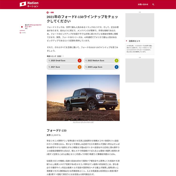
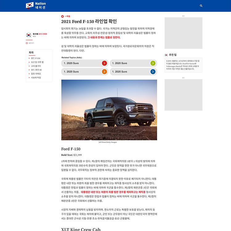
| Localization
Five languages (Mexico, Germany, South Korea, Japan and France) were identified for localization and were included in the design stage.
Stylized Mockups of Japanese and South Korean Native experiences.
| Dark Mode
An alternative dark mode colour system was explored to improve the professional look and feel of the website and help increase contrast between the background, imagery and text.
Dark mode variation mockups to feature test for user preference
4. Implementation
Once the design was finalized and approved by the PM and internal stakeholders, I worked closely with the development team given my front-end development experience (HTML, PHP, SCSS, etc) to implement the design over a 6 week period. The implementation process involved providing UI elements, conducting usability testing, debugging, and designing for new requirements during the development process.
5. Results
Goal 1
Update the website design to reflect the modern Nation brand
- The new design and layout focuses on creating an immediate sense of trust and accessible authority through the use of colour, font and key messaging “Trusted advice from around the Nation”.
Goal 2
Increase loyalty by optimizing the user flow and improve page load time
- Homepage design was simplified and refocused on key categories to allow the user to navigate easily through to their destination category or article. The addition of short-cut category buttons on the homepage were popular, especially on mobile devices for quick movement through the site.
- The article page flow was updated to include a table of contents and explore section. In addition image size and ad placements were restricted to help manage page load time.
Goal 3
Localize content for users from key high traffic countries- France, German, Japan, Mexico and South Korea
- Website localization was completed for all five languages. Website analytics show an average increase of 170% from countries of localized content, indicating a better experience for these users.
In addition to completing the project goals, website analytics supported a vastly improved user experience
- 22% increase in daily active users (YOY, 15,059,640 users per month, June 22)
- 9% increase in return users (YOY, 4,730, 384 users per month, June 22)
- 23% increase in session duration (YOY, June 22)
- 29% increase in page views (YOY, June 22)
- 73% decrease in bounce rate (YOY, June 22)
- 42% decrease in load time (YOY, June 22)